SolarFarms NY: Improved Sign Up

brief
Solar Farms NY commissioned Jenn Studio to refresh their online platform with a modern UI, improving the sign-up flow for a clearer and more efficient user experience, aimed at increasing sales.
The Problem
The old sign-up flow for Solar Farms NY had inconsistent and messy formatting, making it feel unrefined and hard to follow. This cluttered experience did not align with the brand messaging associated with clean energy.
Results & Takeaways
Revitalized SFNY's digital presence that properly reflected the brand's identity. It became important to align the design with brand values to create a more authentic and memorable user experience.
Opportunity
Clearer and more efficient user experience, aimed at increasing sales and signed on users.
Highlights
Key Problems
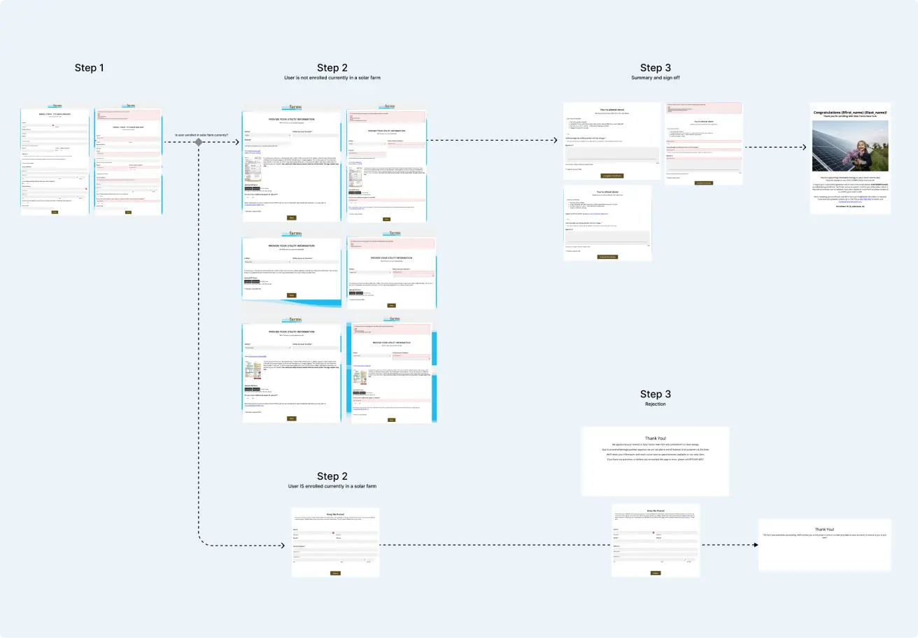
Process
Formstack Limitations
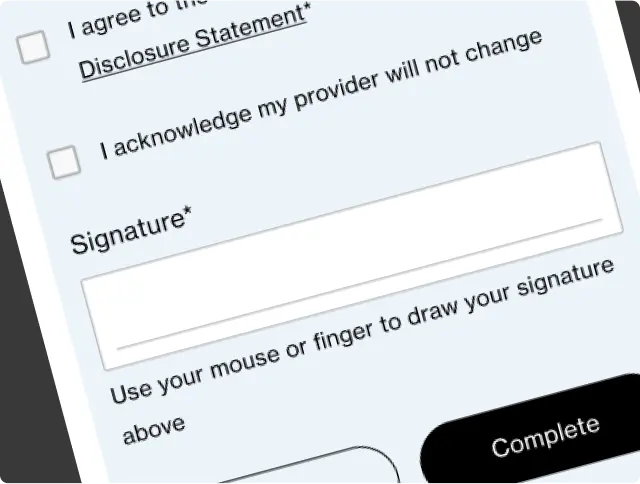
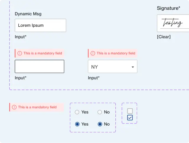
During the design process, we faced limitations with Solar Farms NY's software, Formstack, which restricted element placement. This impacted our design of default, focused, and error states, so we adjusted the theme to work within these constraints.
Initial Proposed Designs
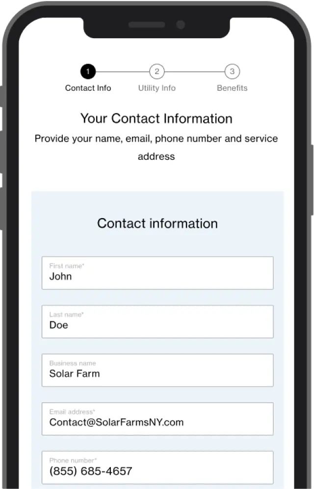
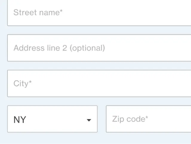
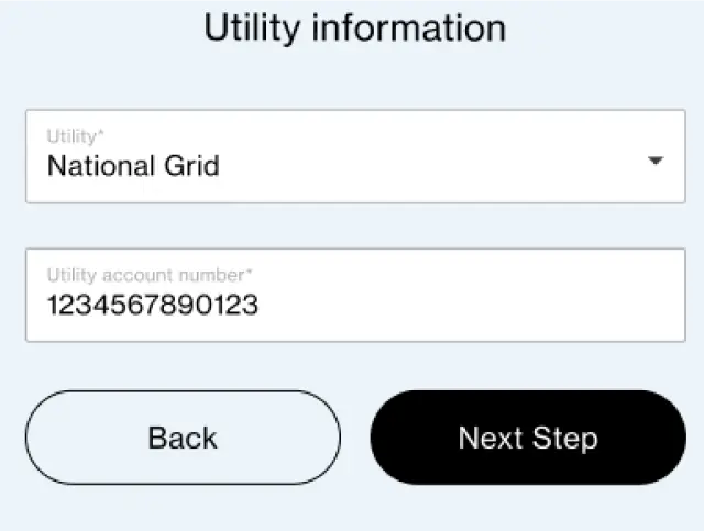
Solution
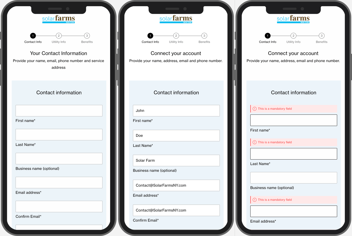
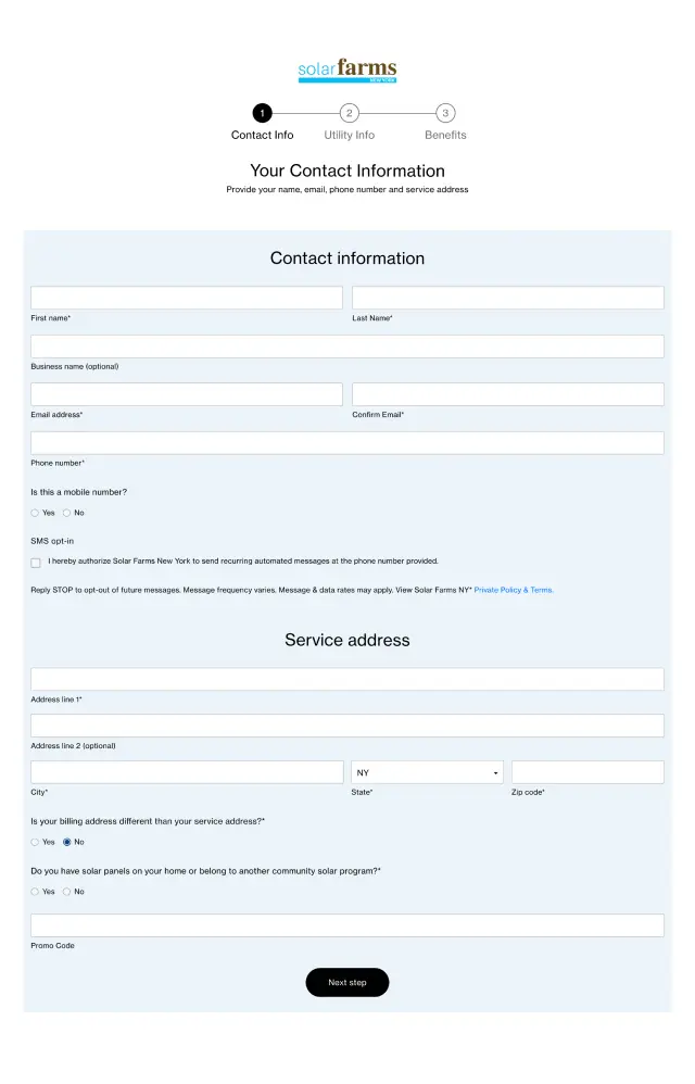
Final Proposed Design
The new design refreshed the UI with a modern look that aligns with the clean energy brand messaging of Solar Farms NY. Improving the sign-up flow with a clearer hierarchy and formatting resulting in a better more efficient user experience.
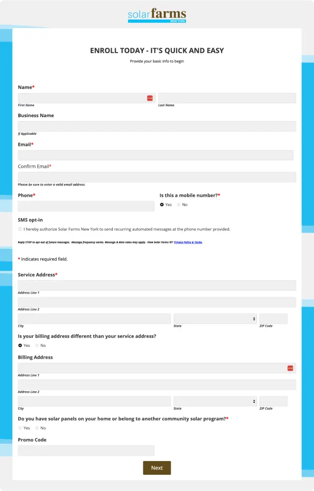
Input States
